My favorite mantra for branding is “communicate vision visually.” Of course, that is an important but not the only consideration for great logo design. Here is an example of some church logos by Auxano Design with a little explanation of how the design connects with the church’s story and vision.
LOGO #1: This congregation declares, “We are God’s Foundry to transform all people into faithful servants of Christ.” The logo creates a dynamic and memorable experience when you see the “molten pour” created by the white space of the mark for the first time. The process of transformation “being poured from God above” is strongly and uniquely visualized. This UMC church connects its identity back to Wesley’s first congregation that literally met in a foundry.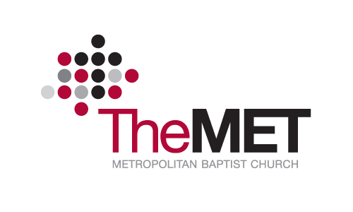
LOGO #2: The Met’s mission is to connect people each day to the real Jesus in a real way. The logo uses dots to represent people connecting. The busyness and sometimes-fragmented activity of suburban living is reflected through the asymmetric circle pattern, inspired by the church’s Kingdom Concept. Yet a cross is revealed in the midst of life’s connections. The tagline of the MET is Live for More.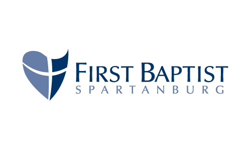
LOGO #3: The mission of First Baptist Spartanburg is to encourage complete and courageous living in Christ. This distinct cross emblem is a visual representation of “encouraging courage,” utilizing a combination of a heart shape (encouraging) and a shield design (courage). The emblem creates four sub-icons for FBS’s strategy – the heart, the shield, the cross, and a hidden icthus in the image. You can see them on the Web site.
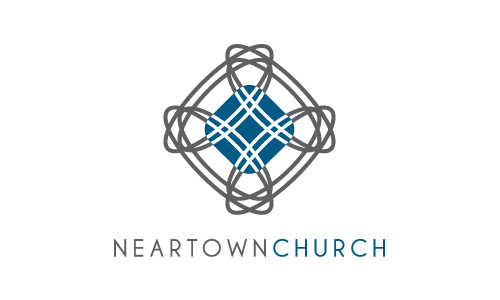
LOGO #4: The Kingdom Concept of Neartown is to bring the whole gospel to busy young dad’s who are moving back to the city, signified ultimately by a deep experience of the peace of Jesus. The engaging and symmetric design is a unique, stylized cross connoting peace. Yet the cross also resembles a mix-master as a symbol of busy, city life. The beauty of the mark and subtle reference to a highway interchange creates a dynamic conceptual tension to highlight the mission. A masculine color scheme was chosen to resonate with the target audience.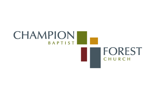
LOGO #5: The mission of CFBC is to make sense out of life through Christ centered living. Instead of creating a cross “directly” with design, a cross is formed by the white spaced between the “random” placement of different size and color rectangles. The pieces of life don’t always seem to fit, but when Christ is seen at the center, life makes more sense. The unexpected placement of the typeface reinforces the distinction of the entire logo.


